Using Excel 2013 - Add a Trendline (with Equation) to a Graph
(VIEW THIS TUTORIAL AS A VIDEO)
The analysis of experimental results often involves the drawing of a straight line through the data points; the linear regression technique allows for the calculation of such a line. The assumptions usually made in this procedure are:
- The precision of x is much greater than that for y.
- The precision of each y measurement is the same.
- All the data points are used to calculate the best straight line.
Excel can be used to perform a linear regression analysis (and to add the trendline equation determined from this to a graph) in the following fashion:
| 1. | Click on Design tab under Chart Tools. | 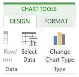 |
| 2. | Click on Add Chart Element and then select Trendline section followed by More Trendline Options. | 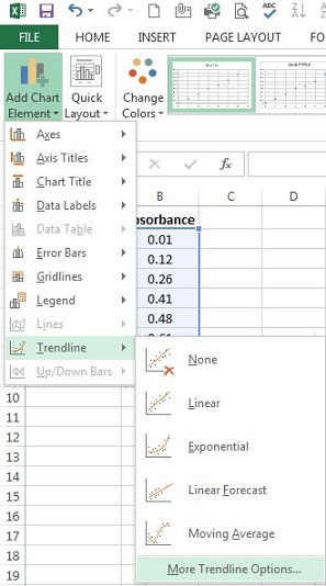 |
| 3. | On the right side will appear Format Trendline window. Under Trendline Options, select Linear. | 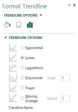 |
| 4. | At the bottom of the window, tick the box next to Display equation on chart, then click Close. | 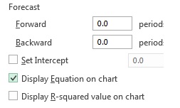 |
| Your spreadsheet should now look something like that shown opposite. Notice how the program has drawn the best fitting straight line through your data, and also plotted the equation of this straight line on the screen. IMPORTANT NOTE: The chart title that has been used is an example of an "uninformative" graph title | 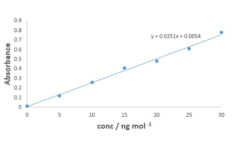 | |