Using Excel 2016 - Plotting Graphs
(VIEW THIS TUTORIAL AS A VIDEO)
The analysis of experimental results often involves the plotting of graphs. To do this in Excel is straightforward and will demonstrated using the data used for the Adding Experimental Data section of this tutorial.
| 1. | Select the data and click on the Insert tab at the top of the spreadsheet. | 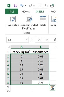 |
| 2. | Click on Scatter followed by the icon for the scatter chart with no lines shown. The graph will then appear on the page. | 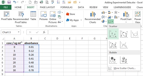 |
| 3. | Click on the Design tab under Chart Tools. | 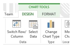 |
| 4. | Click on Add Chart element and select Axis title followed by Primary Horizontal. | |
| 5. | A box labelled Axis Title will appear at the bottom of the graph. Highlight the text and type the x-axis label. In this case this is conc / ng ml-1. |  |
| 6. | To obtain subscript -1, highlight it in title area and press right click, select Font. From list of options that appear, tick Superscript. Finally press OK. | 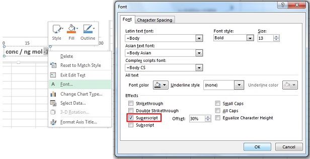 |
| 7. | Click on Add Chart element and select Axis title followed by Primary Vertical. | |
| 8. | A box labelled Axis Title will appear at the left of the graph. Highlight the text and type the y-axis label. In this case this is Absorbance. Graph should look like one on right. | 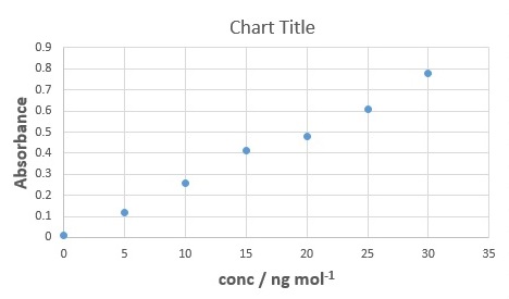 |
| 9. | Click on the Format tab under Chart Tools. | |
| 10. | Select Vertical (Value) Axis Major Gridlines from the drop down menu of Chart Area section, so they become highighted on the graph then hit Delete button on your keyboard. |  |
| 11. | Repeat steps 8 - 9, this time selecting Horizontal (Value) Axis Major Gridlines from the drop down menu of Chart Area section. | |
| 12. | Click Format Selection. |  |
| 13. | Format Chart Area window will appear on right side on worksheet. On Border section, select No Line and then close the tab. |  |
| 14. | Finally click on the current Chart Title and delete it - Your spreadsheet should now look like one on right.
The graph is now in a format suitable for use in a laboratory report. IMPORTANT: When included in a report - Centred beneath the plot there should be a figure number followed by a descriptive caption. Note that captions should be comprehensive but concise. The caption should describe the data shown and can also be used to draw attention to important features contained within the figure or explain the purpose of the plot. | 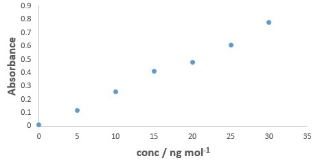 |
A general rule-of-thumb is that graphs should be displayed with data points and without lines connecting the data points (as shown in the example). When you connect two data points with a line you are claiming that the relationship between the plotted parameters is defined by that line (between those points). Thus for the example above, if the data points were connected by lines then you would be claiming that the linear relationship between the 2nd and 3rd data points is different to the relationship between the 3rd and 4th data points (since clearly the lines connecting them would not have the same slope and intercept).
An exception to the above rule is when there are too many data points on the plot for the individual data points to be (clearly) distinguished. In this case the data should be shown as a line connecting the data points and with no markers. One situation where this typically occurs, is when displaying imported spectra.
| SOME NOTES ON "INFORMATIVE" PLOTS. The purpose of a plot is to clearly show data; with any trend(s) displayed by the data also being clearly evident. However, there are occasions when the nature of the data leads to the standard plot (generated as detailed in the "Using Excel 2016 - Plotting Graphs" section above) being "uninformative". Ways of addressing this issue for the three most common "problem" situations are shown below. |
|||
| 1) Using a Secondary Axis In the example shown below, the plot of the reaction profiles is useful for species A and C, but it is not clear from the plot what is happening with species B. 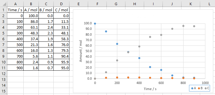 |
|||
| 1. | Right click on one of the data points (on the graph) of the series you wish to plot using a secondary axis and select Format Data Series. | 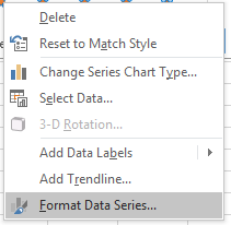 |
|
| 2. | From the Format Data Series - Series Options that appear, tick Secondary Axis.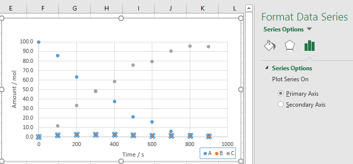 | ||
| 3. | Add an informative title to the secondary axis and (if necessary) edit the primary axis title. | 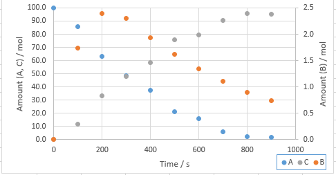 |
|
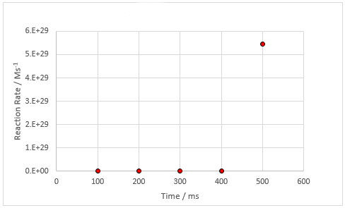
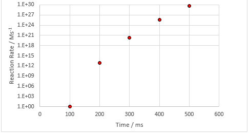
| 2) Using a Log Scale In the example (shown opposite) it appears that nothing happens for 400 ms, at which point the reaction spontaneously (and rapidly) occurs. In order to establish if this is in fact what the data is showing we would need to zoom into this area (i.e. the low reaction rate region) of the plot. The issue would then be that the 500 ms data point would no longer appear on the plot. A way of showing (on this plot) what is occurring at low reaction rates, whilst still displaying all the data would be to use a log scale: |
 |
|
| 1. | Right click on the y-axis and select Format Axis. | 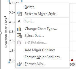 |
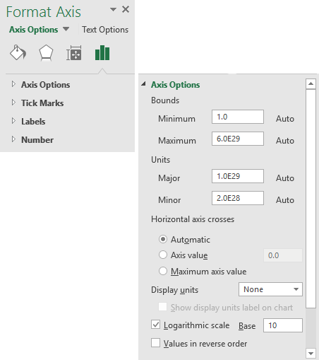
| 2. | Select Axis Options from the Format Axis menu.Under Axis Options, tick the Logarithmic scale box. We can now clearly see (on the log scale graph) that the reaction does not in fact begin after 400 ms, it actually starts immediately (but very, very slowly) and rapidly increases as time progresses. Note: A similar procedure can be used to generate a log scale on the x-axis. |
 |
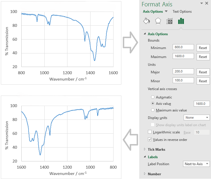 3) Using a Reverse Axis
Most plots have an x-scale that goes low (left) to high (right). However there are occasions when you want the scale to go in the opposite direction, e.g. for a infrared spectrum where the convention is for the wavenumber scale to go high (left) to low (right). This can easily be achieved, using a similar procedure as for "Using a Log Scale" (above):
- Right click on the x-axis and select Format Axis.
- Select Axis Options from the Format Axis menu.
- Under Axis Options, tick the Values in reverse order box.
- Under Labels, select Next to Axis as the Label Position.