Using Excel 2003 - 2.4) Add a Trendline to just part of, or Add Multiple Trendlines to, a Graph
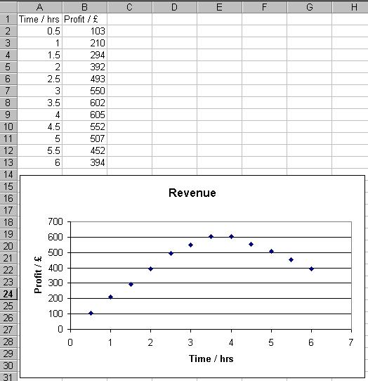
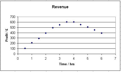
Enter the data and generate a graph so that your worksheet looks like the one displayed below.
To add a trendline to just the initial linear portion of the plot:
- Duplicate (or copy) all the profit entries in Column B in Column C. Title Column C Linear.
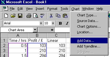
- Click on the Chart or Plot Area.
- Select Chart from the menu at the top of the screen, and Add Data... from the drop-down menu that appears.
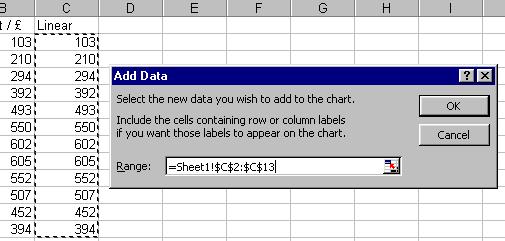
- Block highlight the duplicated data (in this case C2 to C13) and then click OK
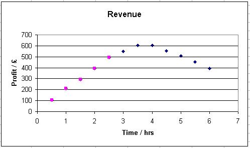
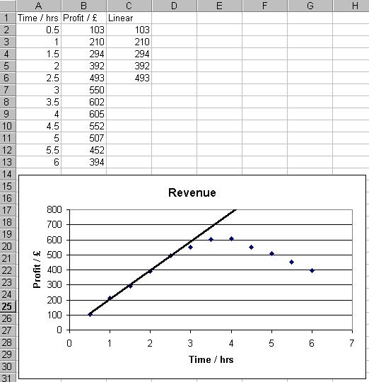
- Look at the plotted data and decide which points you wish to use when you add the trendline (in this example the first 5 points). Delete the other points from Column C.
Your plot should now look like the figure below.
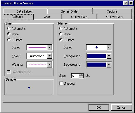
- The blue diamonds represent the entire data set (with some of them hidden behind the pink squares) and the pink squares represent the initial linear portion of the data. Right click on one of the pink squares and select Format Data Series... from the options that appear.
- Click on the Patterns tab of the Format Data Series box that will be displayed.
- Set the Marker Style:, Foreground: and Background: so that the markers appear identical to the first data set (i.e. the blue diamonds in this example). Then click on OK.
- The graph will now appear to have just one data set plotted on it.
- Click on one of the graph points of the linear region and then select Chart from the top menu, and Add Trendline... from the drop-down menu that appears.
- Set the Trendline options as desired (more information on this can be found in Chapter 1.5) and click on OK. The trendline (using just the initial linear data) will be added to the graph. If necessary, rescale the graph - more information on this procedure can be found in Chapter 2.1
To add multiple trendlines:
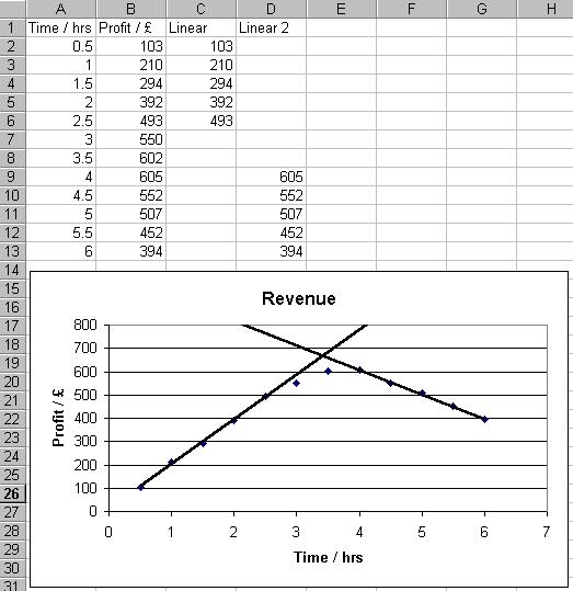
- Continuing with the example above, if we now wanted to add another trendline to the final linear portion of the plot, we would copy the profit data into Column D, and repeat the process detailed above (for the final 5 data points). The worksheet and graph would end up appearing as shown below.