Using Excel 2003 - 1.4) Plotting a Graph
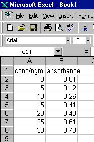
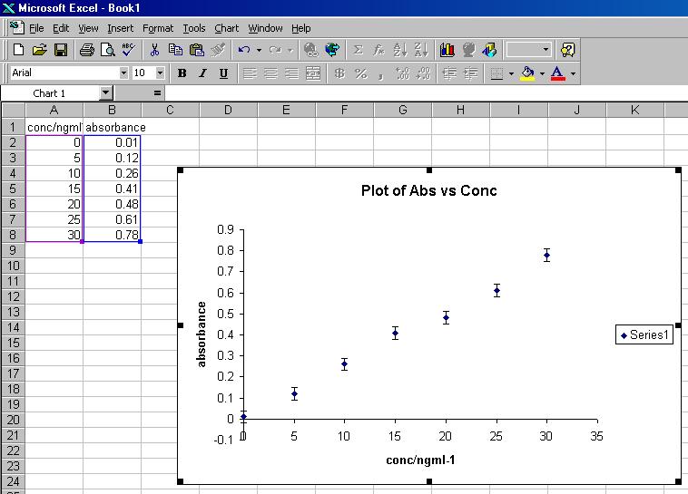
On Sheet 2, enter the data as displayed below.
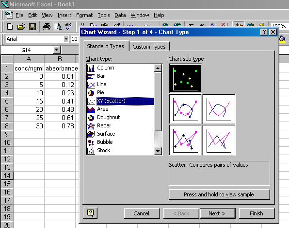
To plot this data as a graph:
- Click on the Chart icon at the top of the spreadsheet.
- Click on XY (Scatter).
- Click on the scatter chart (no lines shown).
- Click on Next >.
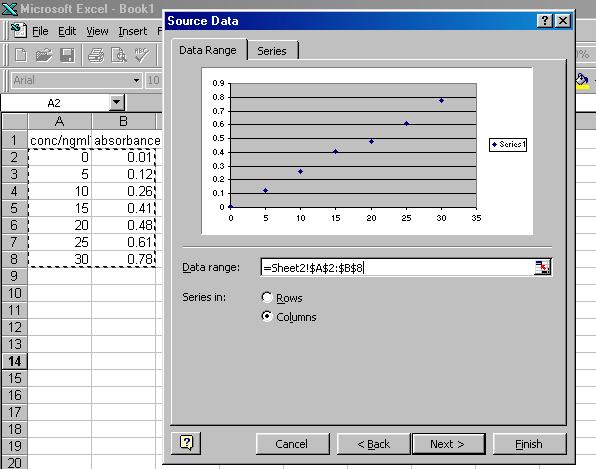
- Highlight the data you wish to plot (in this case the block encompassing cells A2 through to B8).
Note: The data in the first column will be used for the x-axis, all other selected columns will be plotted as corresponding values on the y-axis.
- Click on Next >.
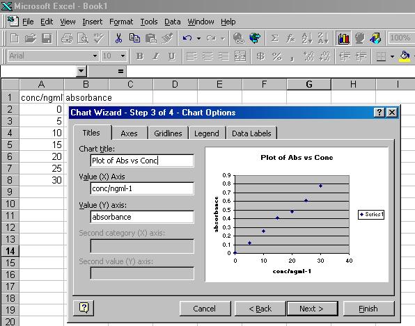
- Click in the box under Chart title, and type the title for the graph (in this case Plot of Abs vs Conc).
Click in the box under Value (X) Axis, and type the x-axis label (in this case conc/ngml-1).
Click in the box under Value (Y) axis, and type the y-axis label (in this case absorbance).
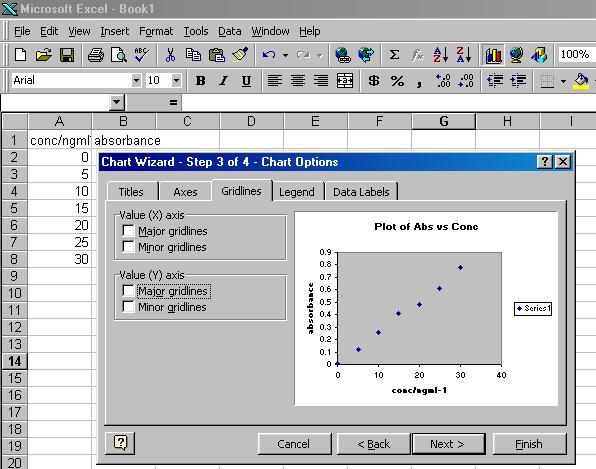
- Click on Gridlines, and then click on any white box that contains a tick-mark.
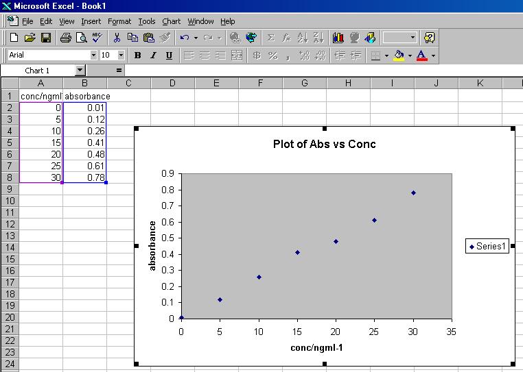
- Click on Finish. Your spreadsheet should now look like the figure below.
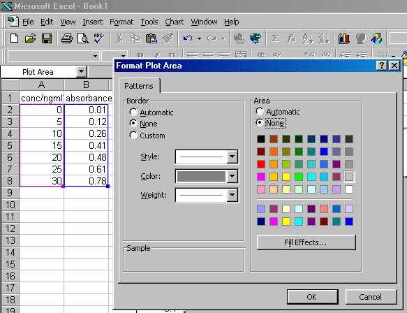
- Double click on the grey central region of the graph, then click on the white circle to the left of None under both the Area and Border headings.
Then click on OK.
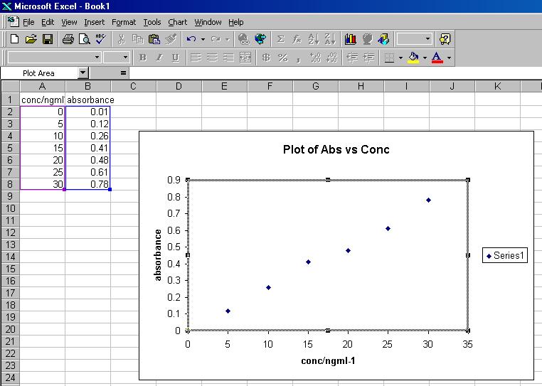
The graph is now in a format suitable for the Physical Chemistry Teaching Laboratory, and your spreadsheet should look like the figure below.
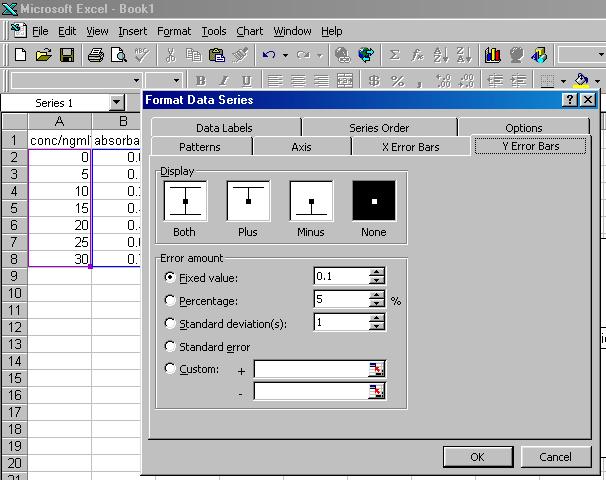
Typically the y-data will be associated with an estimated error, which should be displayed on the graph as 'error bars'. Error bars are added to a graph in the following fashion:
- Double click carefully on one of the data points on the graph.
- The Format Data Series window should now have appeared.
- Click on Y Error Bars.
- Click on the circle to the left of Custom.
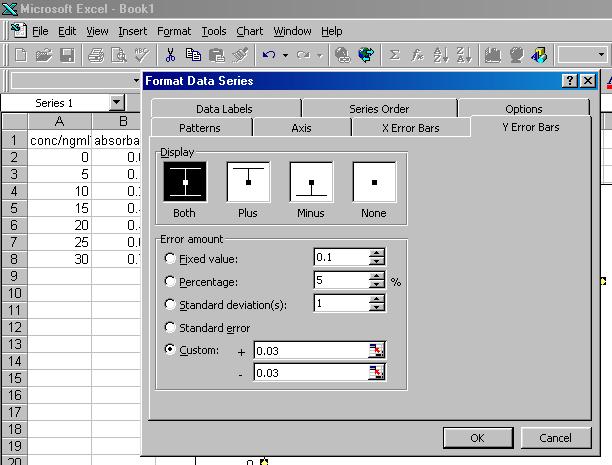
- Type 0.03 (the estimated error on the absorbance measurements in this case) in both boxes to the right of + and -.
- Click on OK. Your spreadsheet should now look like the figure below.