Using Origin 2017
Plotting a graph
One of the main uses of spreadsheets is to neatly and informatively present data graphically.
Example: The Arrhenius equation is defined as: k = A e-Ea/RT where k is the rate coefficient (s-1), A the pre-exponential factor (s-1), R the gas constant (8.314 Jmol-1K-1), Ea the activation energy (J mol-1) and T the temperature (K). In the Briggs-Rauscher reaction (obeying the Arrhenius equation), the (overall) rate coefficient for the reaction was monitored as a function of temperature:
| Temperature / K | 298 | 295 | 292 | 289 |
| Rate Coeffcient / s-1 | 0.078 | 0.052 | 0.037 | 0.022 |
| 1. | Enter the data above into Origin (as columns and not rows) |  |
| 2. | Label the columns with the correct units. Note: Using "\" and either "+" or "-" will allow superscriptand subscript for appropriate labelling of axis. |
|
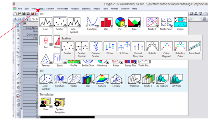
| 3. | Highlight the columns and select plot → symbol → scatter. A graph will be plotted. |
 |
| 4. | To add a title to the graph, select the "Text Tool" (left hand side of Origin), then click on the plot where you wish the title to appear and enter the title text. |  |
| 5. | If necessary the scale of the plot can be altered by double clicking on the selected axis and then clicking "scale". | |
Once the plot has been completed, it should appear as shown below.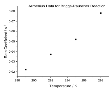 |