Using Excel 2013 - Plotting Graphs
(VIEW THIS TUTORIAL AS A VIDEO)
The analysis of experimental results often involves the plotting of graphs. To do this in Excel is straightforward and will demonstrated using the data used for the Adding Experimental Data section of this tutorial.
| 1. | Select the data and click on the Insert tab at the top of the spreadsheet. | 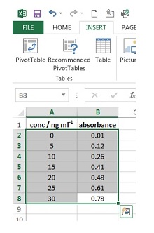 |
| 2. | Click on Scatter followed by the icon for the scatter chart with no lines shown. The graph will then appear on the page. | 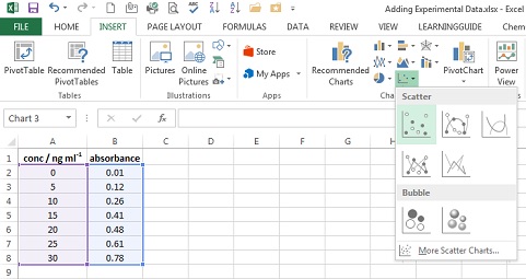 |
| 3. | Click on the Design tab under Chart Tools. | 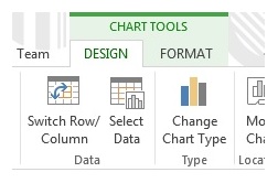 |
| 4. | Click on Add Chart element and select Axis title followed by Primary Horizontal. | |
| 5. | A box labelled Axis Title will appear at the bottom of the graph. Highlight the text and type the x-axis label. In this case this is conc / ng ml-1. |  |
| 6. | To obtain subscript -1, highlight it in title area and press right click, select Font. From list of options that appear, tick Superscript. Finally press OK. | 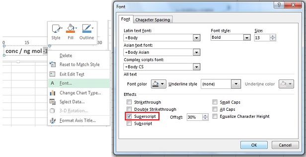 |
| 7. | Click on Add Chart element and select Axis title followed by Primary Vertical. | |
| 8. | A box labelled Axis Title will appear at the left of the graph. Highlight the text and type the y-axis label. In this case this is Absorbance. Graph should look like one on right. | 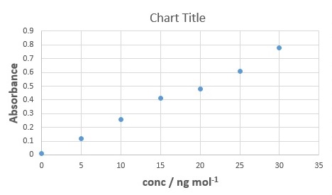 |
| 9. | Click on the Format tab under Chart Tools. | |
| 10. | Select Vertical (Value) Axis Major Gridlines from the drop down menu of Chart Area section, then hit Delete button on your keyboard. |  |
| 11. | Repeat steps 8 - 9, this time selecting Horizontal (Value) Axis Major Gridlines from the drop down menu of Chart Area section. | |
| 12. | Click Format Selection. | 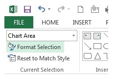 |
| 13. | Format Chart Area window will appear on right side on worksheet. On Border section, select No Line and then close the tab. | 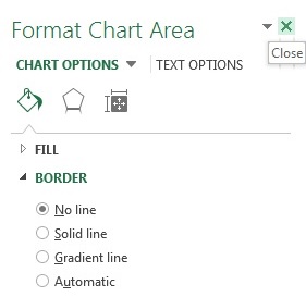 |
| 14. | Your spreadsheet should now look like one on right. Finally click on the current Chart Title and replace it with a more informative title, i.e. do not just re-iterate what the axis titles are. The graph is now in a format suitable for the Level 4 Teaching Laboratory. | 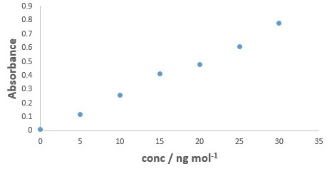 |
A general rule-of-thumb is that graphs should be displayed with data points and without lines connecting the data points (as shown in the example). When you connect two data points with a line you are claiming that the relationship between the plotted parameters is defined by that line (between those points). Thus for the example above, if the data points were connected by lines then you would be claiming that the linear relationship between the 2nd and 3rd data points is different to the relationship between the 3rd and 4th data points (since clearly the lines connecting them would not have the same slope and intercept).
An exception to the above rule is when there are too many data points on the plot for the individual data points to be (clearly) distinguished. In this case the data should be shown as a line connecting the data points and with no markers. One situation where this typically occurs, is when displaying imported spectra.