Instructions for Exercise 4:
For this exercise, the following sections from the Excel 2016 Web tutorial will be useful:
- Convert pressure from mBar to Pa and temperature from
° C to K using these conversions:1 Bar = 100 000 PaK =° C + 273.15 - Select the data and insert a scatter chart with no lines.
(Instructions on how to plot a graph can be found here)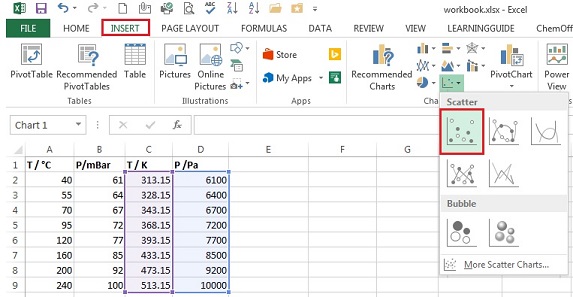
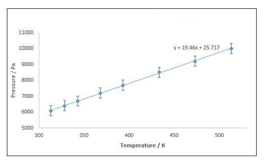
- Add chart elements such as axes labels and an appropriate title.
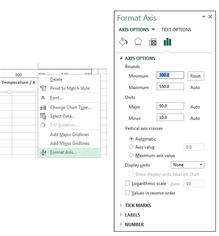
(Instructions on how to do that can be found here) - If you need to rescale the chart area then right click on y-axis values and select Format axis. On the right will the appear
Format Axis window, through which the bounds of minimum and maximum can be changed. The same can be done for the x-axis.
- Now add error bars (to add error bars follow these instructions here).
In this case you will need to change the fixed value for error bars from 1.0 to 317.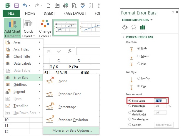
- Add a trendline to your graph (to add a trendline follow these instructions here). Format the trendline as you need it, you can do this by right clicking on the trendline and select Format Trendline.
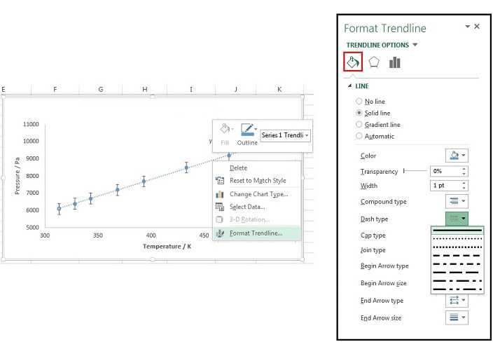
- Your graph should look similar to the one given below:
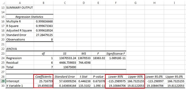
- To perform a linear regression on your Pressure-Temperature data follow these instructions here.
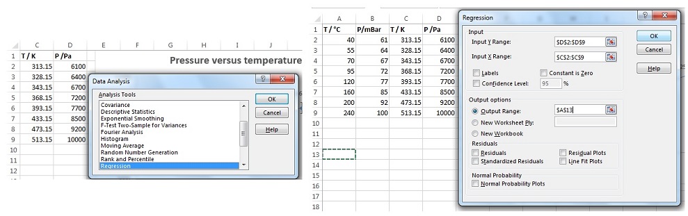
- Your spread sheet should like this:
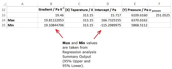
- Use your line equation to find the pressure (y) at 40
° C (313.15K).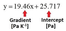
You can use excel to help calculate this value with its associated error:
- To calculate the gas concentration in mM use Ideal gas equation and rearrange to obtain:
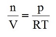
There is an error associated with the pressure (p); assume that there is a negligible error in the temperature. You can use excel to calculate the gas concentration with associated error:

Now you can go back to Exercise 4.